Replaced with Blazor Components
This section serves as an introduction to Razor components. Links to further detailed discussion can be found within most of the topics covered here.
The Razor component is the basic building block for a Blazor application. Each one represents a snippet of user interface (UI). Components are defined in .razor files and incorporate a mixture of HTML and C# code. They act as templates for rendering HTML to the browser. You use Razor syntax to embed C# code within HTML in a component to generate UI content dynamically.
Components often comprise of other components and can coordinate with each other via parameters and callbacks. They can maintain state and handle events.
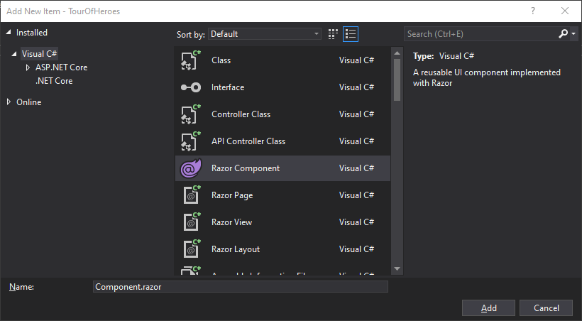
You can create a Razor component within Visual Studio using the Add New Item dialogue:
Or you can use the dotnet CLI command:
dotnet new razorcomponent --name [Name Of Component] --output [Location of generated file]
The name of the component must start with a capital letter. If no name is specified, the name of the current directory is used.
You use Razor components to create
- Navigable pages
- Layouts
- Reusable snippets of UI
- Behaviour that has no UI
The following code block shows the Counter component that forms part of the default Blazor project:
@page "/counter"

<h1>Counter</h1>

<p>Current count: @currentCount</p>

<button class="btn btn-primary" @onclick="IncrementCount">Click me</button>

@code {
    private int currentCount = 0;

    private void IncrementCount()
    {
        currentCount++;
    }
}
This component has an @page directive followed by a route template, which makes it a navigable page (see the next section). This is followed by a block of HTML with some C# embedded using the Razor syntax, and finally a block of pure C# code enclosed in an @code block.
Navigable Pages
Components behave like web pages and can be navigated to when they have an @page directive added followed by a route template. This example defines a component that will be rendered when the user navigates to /about:
@page "/about"

<h1>About Us</h1>
Components can respond to multiple routes. Additional routes are specified by adding further @page directives:
@page "/about"
@page "/about-us"

<h1>About Us</h1>
You can read more about routing here.
Layouts
Components become layouts when they inherit LayoutComponentBase and include @Body within their markup, highlighted below in MainLayout.razor, which is included in the default Blazor project template:
@inherits LayoutComponentBase

<div class="sidebar">
    <NavMenu />
</div>

<div class="main">
    <div class="top-row px-4">
        <a href="http://blazor.net" target="_blank" class="ml-md-auto">About</a>
    </div>

    <div class="content px-4">
        @Body
    </div>
</div>
You can read more about layouts here.
Reusable UI
Components can include other components as part of their content, which means that they can be used to represent simple or complex UI that is used in multiple places within an application. The MainLayout component above includes a NavMenu component, defined in NavMenu.razor located in the same folder. The NavMenu component generates the main navigation menu. It includes multiple instances of the NavLink component, which is built into Blazor.
Components are included within other components by placing HTML-like tags containing the name of the component in the position that you want the component to render, as you can see demonstrated by the <NavMenu /> placed within the div above.
While the Counter component from the default template has been designed as a standalone page, it can also be included as a child of other components as the following example illustrates. The counter is included within the Index component after the SurveyPrompt component:
@page "/"

<h1>Hello, world!</h1>

Welcome to your new app.

<SurveyPrompt Title="How is Blazor working for you?" />

<Counter />
Components authored within .razor files are compiled to C# classes that derive from ComponentBase.
Component Parameters
Components can take parameters, enabling you to pass data to the component so that you can use it for setting initial state etc. A component parameter is a public property decorated with the Parameter attribute. In the next example, the Counter component has been modified so that the private currentCount field becomes a parameter:
@page "/counter"

<h1>Counter</h1>

<p>Current count: @currentCount</p>

<button class="btn btn-primary" @onclick="IncrementCount">Click me</button>

@code {
    [Parameter]
    public int currentCount { get; set; } = 0;

    private void IncrementCount()
    {
        currentCount++;
    }
}
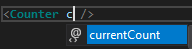
The parameter is exposed as an attribute as part of the component markup:
As with any parameter value, you can pass in a constant or the result of an expression or computation that generates the correct data type:
<Counter currentCount=5 />
<Counter currentCount=DateTime.Now.Year />
<Counter currentCount=SomeMethod() />
Note that the values passed to the parameter do not include quotes around them in this example. You can surround the values with quotes and the application will work fine. If the value being passed to a parameter is a string, you must surround it in quotes as with the SurveyPrompt component's Title parameter in the default Index component:
<SurveyPrompt Title="How is Blazor working for you?" />
If you use an identifier to represent a string, you must prefix the name of the identifier with the Razor @ token:
<SurveyPrompt Title=@surveyTitle />

@code{
    private string surveyTitle = "How is Blazor working for you?";
}
Again, double quotes around @surveyTitle are optional.
ChildContent Parameters
ChildContent parameters enable you to pass content to a component via a parameter with a RenderFragment data type. The parameter is named ChildContent by convention. The following example shows a component named ChildContentExample with a ChildContent parameter:
<h3>Child Content Example</h3>
@ChildContent
@code {
    [Parameter]
    public RenderFragment ChildContent { get; set; }
}
The content supplied to the parameter is displayed where the @ChildContent expression is placed. The main difference between a ChildContent parameter and the examples that have been shown before is how the value is assigned. ChildContent is not assigned to an attribute within the component's tag, it is provided as content within the component's tags:
<ChildContentExample>
    <div class="alert alert-info">This is the Child Content passed by the parent component</div>
</ChildContentExample>
EventCallback Parameters
Parameters with an EventCallback type are designed to allow a caller to be notified when an event takes place in a child component. You can learn more about EventCallback parameters in the section on Razor component DOM event handling.
Cascading Parameters
Cascading parameters are a special type of parameter designed to enable access to Cascading Values within descendant components in a component hierarchy. You can read more about this in the section on cascading values and parameters in Razor components.
Component Life Cycle
The life cycle of a component is defined by a series of pre-defined events that fire. Each of these events call methods that you can override, providing hooks into the life cycle that you can leverage to perform tasks, knowing the state of the component at the time. The life cycle hooks are covered here.
