When you allow users to provide values that you then process, you need to ensure that the incoming values are of the expected data type, that they are within the permitted range and that required values are present according to your application's business rules. This process is known as input validation.
The term "user input" covers any value that the user has control over. Values provided via forms constitute the bulk of user input, but user input also comes in the form of values provided in URLs and cookies. The default position should be that all user input is to be considered untrusted and should be validated against business rules. Here, we concentrate our focus on validating form values.
You can perform validation on form data in two places in a web application: in the browser using either client-side code or the browser's in-built data type validation; and on the server using C# code. However, you should only ever view client-side validation as a courtesy to the user because it is easily circumnavigated by anyone who knows how to use the browser's developer tools for example. Server side validation should be seen as essential.
On the server, it is the API's responsibility to validate incoming data. In Blazor WASM, form validation takes place on the client.
Validation using DataAnnotation attributes
The Blazor input validation story is built around the EditContext, input validation components and a set of attributes that inherit from ValidationAttribute. Most of these attributes reside in the System.ComponentModel.DataAnnotations namespace. Each attribute is designed to perform a specific type of validation be it for presence, data type or range. Some also enable you to test the incoming value against an acceptable pattern.
The following table lists the validation attributes that you are most likely to use and the type of validation they provide, together with example usage.
| Attribute | Description |
|---|---|
Compare |
Used to specify another property that the value should be compared to for equality [Compare(nameof(Password2))] |
MaxLength |
Sets the maximum number of characters/bytes/items that can be accepted [MaxLength(20)] |
MinLength |
Sets the minimum number of characters/bytes/items that can be accepted [MinLength(2)] |
Range |
Sets the minimum and maximum values of a range [Range(5,8)], Range(typeof(DateTime),"2021-1-1","2021-12-31")] |
RegularExpression |
Checks the value against the specified regular expression [RegularExpression(@"[a-zA-Z]+")] |
Required |
Specifies that a value must be provided for this property. Non-nullable value types such as DateTime and numeric values are treated as required by default and do not need this attribute applied to them [Required] |
StringLength |
Sets the maximum, and optionally, the minimum number of string characters allowed [StringLength(2)], [StringLength(10, MinimumLength=2)] |
In addition, there are some data type validation attributes including Phone, EmailAddress, Url and CreditCard. These validate incoming values against predetermined formats to ensure that they are "well-formed". Documentation on what the attribute authors consider to be well-formed is sparse, but you can always resort to looking at the source code to see the logic used to test the incoming value to ensure that the implementation covers your business rules. The .NET Source Browser is a great tool for this purpose (https://source.dot.net/). Using that, or going directly to the source code for the EmailAddressAttribute, for example, will show you that email "validation" consists of little more than checking the presence of the "@" character in the input. The check ensures that there is only one instance of the character and it is not at the beginning or end of the input. So "a@b" will pass this validation test.
Basic Validation Example
The following InputModel class has four properties, all strings. They are all decorated with the Required attribute. The EmailAddress property will also be validated by the EmailAdress validator. The Password property has the MinLength attribute set to 8 and the Password2 property is decorated with the Compare attribute, which has the name of the Password field assigned to otherProperty parameter. Multiple attributes can be applied as separate declarations within their own square brackets (see the EmailAddress property), or as a comma separated list (Password property):
public class InputModel
{
    [Required]
    public string Name { get; set; }
    [Required]
    [EmailAddress]
    public string EmailAddress { get; set; }
    [Required, MinLength(8)]
    public string Password { get; set; }
    [Compare(nameof(InputModel.Password))]
    public string Password2 { get; set; }
}
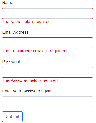
An EditForm has an instance of the InputModel passed to its Model parameter. Each property has a corresponding input validation component (InputText) for capturing its data and a ValidationMessage component for displaying any validation error messages. The form also includes a DataAnnotationsValidator component. This is needed to enable automatic validation.
<EditForm Model="model">
    <DataAnnotationsValidator /> <!-- Required for validation -->
    <div class="mb-3">
        <label for="Name" class="form-label">Name</label>
        <InputText @bind-Value=model.Name class="form-control" /> <!-- Input validation component -->
        <ValidationMessage For="() => model.Name" /> <!-- Display validation messages for this property -->
    </div>
    <div class="mb-3">
        <label for="EmailAddress" class="form-label">Email Address</label>
        <InputText @bind-Value=model.EmailAddress class="form-control" />
        <ValidationMessage For="() => model.EmailAddress" />
    </div>
    <div class="mb-3">
        <label for="Password" class="form-label">Password</label>
        <InputText @bind-Value=model.Password class="form-control" />
        <ValidationMessage For="() => model.Password" />
    </div>
    <div class="mb-3">
        <label for="Password2" class="form-label">Enter your password again</label>
        <InputText @bind-Value=model.Password2 class="form-control" />
        <ValidationMessage For="() => model.Password2" />
    </div>
    <div class="mb-3">
        <button class="btn btn-primary">Submit</button> <!-- Validation initially fires when form submitted -->
    </div>
</EditForm>
</div>
@code {
    InputModel model = new();
}
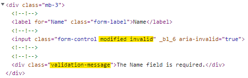
The form is initially validated when it is submitted. Default validation error messages are displayed within a div element generated by the ValidationMessage component. The div has a CSS class of validation-message applied to it. The inputs have CSS classes applied to them - either valid or invalid. Styles for these classes are defined in the template version of app.css and can be modified easily.
You can customise the error message itself via the validation attribute's ErrorMessage property:
[Required(ErrorMessage="Please provide your name")]
public string Name { get; set; }
The validation status of each field is updated when the value is changed. Once a value has been changed, another CSS class, modified, is applied to its rendered form control.
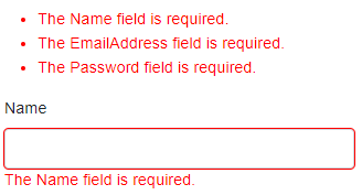
A summary of all validation messages can be presented in one place instead of, or in addition to those for individual properties by adding a ValidationSummary component to the form where you would like the validation errors to be displayed in an unordered list:
<EditForm Model="model">
    <DataAnnotationsValidator />
    <ValidationSummary />

    //...

</EditForm>
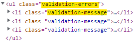
The ul element has a CSS class of validation-errors applied to it and individual error messages get the same validation-message class as the ValidationMessage component:
Manual Validation
The EditForm component exposes a number of events that fire when a form is submitted that you can hook into by passing an EventCallback to the corresponding parameter:
OnSubmit- fires for every form submission but does not validate the formOnValidSubmit- fires only if there are no validation errorsOnInvalidSubmit- fires only if there are validation errors
When the form is submitted, a check is made to establish if a delegate has been specified for the OnSubmit event. If it has, the delegate is invoked. If not, the form is validated, and depending on the result, either the OnValidSubmit or OnInvalidSubmit event is fired.
The OnSubmit event is useful if you want to add some custom validation. For example, you might want to validate a field only in some circumstances. Imagine that you want to capture a postal address. You provide a field for a postal code, but this only applies to addresses in countries that operate a post code system. When the user selects such a country, the post code field is required, otherwise it isn't.
The following example shows two classes - PostalAddress and Country. The StreetAddress property within the PostalAddress class is required:
public class PostalAddress
{
    [Required]
    public string StreetAddress { get; set; }
    public string AddressLocality { get; set; }
    public string AddressRegion { get; set; }
    public string PostalCode { get; set; }
    public string AddressCountry { get; set; }
}

public class Country
{
    public string Alpha2 { get; set; }
    public string Name { get; set; }
    public bool HasPostalCodes { get; set; }
}
A collection of countries is created, some of which have postal codes while others do not:
List<Country> Countries { get; set; } = new List<Country>()
{
    new Country{ Alpha2 = "BW", Name="Botswana", HasPostalCodes = false },
    new Country{ Alpha2 = "TD", Name="Chad", HasPostalCodes = false },
    new Country{ Alpha2 = "IE", Name="Ireland", HasPostalCodes = false },
    new Country{ Alpha2 = "JM", Name="Jamaica ", HasPostalCodes = false },
    new Country{ Alpha2 = "KW", Name="Kuwait", HasPostalCodes = true },
    new Country{ Alpha2 = "MX", Name="Mexico", HasPostalCodes = true },
    new Country{ Alpha2 = "PH", Name="Philippines", HasPostalCodes = true },
    new Country{ Alpha2 = "SE", Name="Sweden", HasPostalCodes = true },
    new Country{ Alpha2 = "GB", Name="United Kingdom", HasPostalCodes = true },
    new Country{ Alpha2 = "US", Name="USA", HasPostalCodes = true }
};
These are used to populated an InputSelect component in a form that takes an EditContext and includes a DataAnnotationsValidator component. It also has an event handler specified for the OnSubmit event:
<EditForm EditContext="editContext" OnSubmit="HandleSubmit">
    <DataAnnotationsValidator/>
    <div class="form-group">
        <label class="form-label">Street</label>
        <InputText @bind-Value="Address.StreetAddress" class="form-control" />
        <ValidationMessage For="() => Address.StreetAddress" class="text-danger d-block" />
    </div>
    <div class="form-group">
        <label class="form-label">Locality</label>
        <InputText @bind-Value="Address.AddressLocality" class="form-control" />
        <ValidationMessage For="() => Address.AddressLocality" class="text-danger d-block" />
    </div>
    <div class="form-group">
        <label class="form-label">Region</label>
        <InputText @bind-Value="Address.AddressRegion" class="form-control" />
        <ValidationMessage For="() => Address.AddressRegion" class="text-danger d-block" />
    </div>
    <div class="form-group">
        <label class="form-label">Postal Code</label>
        <InputText @bind-Value="Address.PostalCode" class="form-control" />
        <ValidationMessage For="() => Address.PostalCode" class="text-danger d-block" />
    </div>
    <div class="form-group">
        <label class="form-label">Country</label>
        <InputSelect @bind-Value="Address.AddressCountry" class="form-select">
            <option value=""></option>
            @foreach (var country in Countries)
            {
                <option value="@country.Alpha2">@country.Name</option>
            }
        </InputSelect>
        <ValidationMessage For="() => Address.AddressCountry" class="text-danger d-block" />
    </div>
    <div class="form-group">
        <button class="btn btn-outline-primary mt-2">Submit</button>
    </div>
</EditForm>
@if(valid)
{
    <div class="alert alert-success mt-3">You submitted a valid form</div>
}
The component that contains the form has members for an EditContext, ValidationMessageStore and PostalAddress. They are brought together in the component's OnInitialized event:
EditContext editContext;
ValidationMessageStore validationMessages;
PostalAddress Address { get; set; } = new();
bool valid;

protected override void OnInitialized()
{
    editContext = new(Address);
    validationMessages = new(editContext);
}
When the form is submitted, the HandleSubmit callback is executed. Within that, we must call the Validate method of the EditContext to manually validate the form. This causes any data annotations validation to execute. Then we check to see if the currently selected country operates a post code system, and if it does, whether a postal code has been provided. If not, we add a message to the validation message store. If a postal code has been provided, we remove any existing validation errors relating to the postal code field and revalidate the form which will result in the EditContext updating.
void HandleSubmit()
{
    valid = editContext.Validate();
    var postalCodeField = editContext.Field(nameof(PostalAddress.PostalCode));
    if (!string.IsNullOrEmpty(Address.AddressCountry))
    {
        var selectedCountry = Countries.First(x => x.Alpha2 == Address.AddressCountry);
        if (selectedCountry.HasPostalCodes)
        {
            if (string.IsNullOrWhiteSpace(Address.PostalCode))
            {
                validationMessages.Add(postalCodeField, "You must provide a postal code");
            }
            else
            {
                validationMessages.Clear(postalCodeField);
                valid = editContext.Validate();
            }
        }
    }
}
